 |
| Seismic acquisition cheatsheet |
Tuesday, February 18, 2014
Seismic acquisition cheatsheet
Saturday, March 23, 2013
Prepare Near Surface Models using Grapher.
INTRODUCTION:

Let me show you how to create a simple NSM model which incorporates the data information like the uphole position, lithology, velocity, optimum depth, elevation, etc using Grapher software.
The following is a part of uphole location map.

Preparation of Data:
Let us prepare an spreadsheet (excel) sheet which contains all the data of the uphole so that it will be easy to import to the Grapher.

SL - Source Line no. UH-Uphole;ELV-elevation;OD-Optimum Depth;D1-Depth 1 with velocity V1;COR_D1-Corrected Depth1(Elevation-Depth).
Importing into Grapher:
For this tutorial I am using Grapher 8.7 although the layout is pretty same for older and newer versions.
1. Start Grapher. Go to File >> Open and open the excel file you have saved as above. The excel sheet is displayed.
2. Now select two columns SL and ELV (while simultaneously pressing control key) and New Graph >> 2D XY Graphs >> Line/Scatter. Now the graph will be displayed.

4. The limits of axis can be changed by clicking on the particular axis in Object Manager and then in properties box select Axis tab and in Axis properties in Axis limits the minimum and maximum can be changed.
5. The default plot name will be like Line/Scatter Plot 1. This name can be confusing when more plot is added to the graph. So the best way is to change it to a more meaning full name like in this case Elevation. Right click on the Line/Scatter Plot 1 and select Rename object to change name.

7. Now the plots which we have created will be more of zigzag due to insufficient sampling. It would be better if the plot is smoothen. Let us smoothen the first plot Elevation. Click on Elevation and then in properties box go to plot tab. In fits click to add/edit fits. Fits dialogue box will appear. In available fits select spline smoothing and Add and click apply and ok. A plot called Fit 1:Spline smoothing will appear. It can be renamed as Fit1:Elevation for better understanding. Now remove the tick mark near the plot Elevation which is created in step3. So now the original plot disappears and new smoothed curve appears. Do this for all the plots. So now they will be smoothed.

9. Now do this for other two layers too except the datum!. For the lower most layer select solid pattern and white colour, so other layers will be blocked.
10. Now let us add the lithology information. Right click on Graph 1 and select add plot. In the select plot type select floating bar and click ok. In choose axes box click ok. Then a dialogue will appear for selecting the excel sheet. Choose the sheet created at first.
11.A floating bar plot with name 'Floating Bar 1' will appear. let us rename it to clay as we are going to represent the lithology of clay in the bar.
12. In object manager select Clay and in properties box go to plot tab and then in X column select the default SL (similar to other plots). Then for Y1 column select column V:Cor_C and for Y2 select column W. Here Y1 represents the upper limit and Y2 represents the lower limit. Width of the bar can be changed by changing the percentage value in Bar width.To change the colour and pattern of the bar go to Fill tab and change the desired properties. Now similarly add the floating bar for Clay+Sand and Sand.
13. To add legend right click graph1 in object manager and select add legend. The legend will appear in graph. Each entry can be edited by selecting the 'legend 1' in the object manager and in properties box go to Legend tab and then click on 'Click here to edit entries'.


15. To add text boxes and other details go to 'draw' in the menu and select required options.
Export options:
1.Tiff for display
2.PNG for web
3.If only lines are used then vector pdf for printing and display.
Don't save as jpeg as compression artefacts are more in jpeg compared to png.
Download the excel sheet used in this tutorial for practice.
Feel free to record your suggestion, doubts, etc.
Disclaimer: All the data sets used in this tutorial is fictitious.
Thursday, January 3, 2013
Prepare SPS for onland seismic data acquition
INTRODUCTION
More often the seismic data is processed by people who are not involved in the acquisition of data. So there is need to exchange data about the position coordinates of source, receiver and their relation. Not only the position coordinates but also other details like drilled depth and uphole time to mention a few have also be to exchanged. Different systems are used for acquisition and processing having their own file formats. So there was a need for industry standard to exchange these data. So in 1993 Society of Exploration Geophysicist (SEG) adopted the SPS standards used by Shell as Industry standard. The original specifications can be downloaded from the link given in references.
SPS standard consist of four simple text files as follows:
- Receiver file - R file
- Source file - S file
- Relation file - X file
- Comment file - Optional
which are formatted to avoid confusion. These standard is used to 3D seismic data acquisition and can be used for other geometries also.
Preparation of SPS
Though there are many ways of preparing SPS an easy way to prepare is by using spreadsheet like excel or calc. Let us have a simple geometry and prepare SPS for it manually.
Geometry:
To keep the manual work less let us consider a simple END ON geometry with following details
Receiver lines - 5
Number of receiver per line - 20
Receiver line interval - 280 m
Interval between two receivers - 80m
Interval between two shots - 80m
Number of Shots per line - 5
Number of shot lines - 2
Shot line interval in 320 m
The unit template is as in the figure below
 |
| Fig 1. Unit Template |
Let us do a in-line swath rollover towards the right side. Since the Shot line interval is 280 m we have to place one more Shot line parallel to existing shot line which is 280 m away and we have to add 4 new receivers in the each line (Hint: 320/80).

So now let us prepare the SPS for a total number of 10 shots.
R file
Receiver file contains the information about the receivers (or stations) type of reciever (geophone, hydrophone).
 |
| Fig 2. R and S file format |
The figure shows the information put in each field. Each field has particular number of columns. By default the columns are right justified. Some columns are left justified which are mentioned and we have to modify it.
Now let us start preparing R file using excel sheet. Open an excel sheet (any spreadsheet) and follow the steps below.
1. Column width adjustment - The column width for the first column as given in the table in 1. . So we have to adjust the column width of each column in the excel sheet upto O column. Now go to the first column. Right click on A and select column width. A dialogue box appears enter 1. Now right click on B and select the column width. Enter 16 in the dialogue box. Repeat it for all the columns till O. Select the column B and align text left. This is the only column which is left aligned in R file. Select the columns K L M and right click format cells. Select number and decimal place 1. Now the excel sheet is ready as below.
 |
| Fig 3. Formatted excel sheet |
2. The bottom leftmost geophone is the first geophone. Let the first receiver line be 101 with starting picket 101. Let the next receiver be 103, 105 and so on. The next receiver line be 108, 115, etc. Let the easting and northing of geophone (101,101) be for example (100000, 2000000)
3. Now let us enter the information of first geophone in the excel sheet. In the cell A1 type R as per the format given in Fig 2. In the B1 we have to enter the line number of first geophone (101) then picket number in C1. In D1 enter the point code as 1. In E1 enter the reciever code for E1 for geophone. In K L M enter easting, northing, elevation. Other cells can be filled with relevant information. If they are not know they can be left.
 |
| Fig 4. R excel |
4. Repeat step three for all the geophones, i.e., 120 geophones (5 x 24). So you will be having 120 rows.
5. Now save it as Formatted text (space delimited) with extension (*.prn). Click ok and ok. Now the saved file is a simple text file which can be opened with any text editor. So your R file is ready
S file
Source file like receiver contains information about the source points like its position coordinates, type of source, etc as given in Fig 2. Another excel sheet can be prepared in the way as prepared for R file. All relevant information shall be entered for each shot point and saved as *.prn file format. For this geometry with two shot lines there will be 10 rows because of 10 shots. The prepared S file is as follows.
 |
| Fig 5. S excel |
X file
Relation file contains data about how source and receiver are related to each other. In simple terms it shows what receivers are active while a particular source point is activated.
 |
| Fig 6. X file format |
The figure shows the information put in each field. Prepare another excel sheet as we prepared for R and S file. The fields are different from R and S file. Prepare and format (right and left alignment) the excel sheet and given in the figure above.
Let me explain the important columns to be entered for the X file.
A - enter X
B - Enter the number of the tape to be used for recording (optional)
F - Shot line number
G - Shot point number
I - starting channel number ( Channel number is a continuous number from 1 to 100 in this survey. Because there are 100 channels active for each shot)
J - Ending channel number
K - Channel increment(How many channels increased in each step)
L - Receiver line number
M - Starting receiver number
N - Ending receiver number.
The final layout appears as below
Since there is Receiver line number in column L We have to prepare the row information for every line in a shot. In this example. There are 5 receiver lines in a shot. So we have to prepare 50 rows ( 10shots x 5 receiver lines)
The x file is prepared as follows.
 |
| Fig 7 X excel file |
Save the excel sheet as prn file.
Now the sps is prepared and final geometry looks like as below.
|
| Fig 8. Geometry |
Comment record (optional)

Revision history
1.Rev1.0
2.Rev2.1
The procedure explained above is for the SPS Rev1.0 . The columns are slightly different in SPS Rev 2.1. The difference between the two formats can seen from the following figures.
 |
| Fig 9 SPS 2.1 R and S file format |
 |
| Fig 10 SPS 2.1 X format |
References/Further reading:
1. "Shell Processing Support (SPS) format for Land 3-D surveys - rev0 " Geophysics, 60, no.2, 596-610
1. "Shell Processing Support (SPS) format for Land 3-D surveys - rev0 " Geophysics, 60, no.2, 596-610
2. "Shell Processing Support Format (SPS) for Land 3-D Surveys - rev2.1".
3. For other SEG technical standards.
3. For other SEG technical standards.
Terms used:
1.Unit Template is the smallest shooting pattern which gets repeated in certain directions.
In the Unit template all the shots have same set of active receivers.
Wednesday, April 11, 2012
Create Contour Maps using Surfer
Contour maps
While acquiring seismic data for hydrocarbon exploration one has to plot a variety of contour maps like velocity or depth contour maps for uphole surveys, frequency contour maps for the data acquired, etc. One of the easiest and efficient way of making contour maps is by using Surfer software.
Definition
A contour is a line on a map or a chart delineating those points which have same plotted quantity like depth, velocity, altitude, etc. In simple words it is a line connecting points of same altitude or depth, etc in a map.
Allowance has to be made for uncertainties so that noise is not contoured, and a contour value of Ci can be thought of as marking the middle of a zone that contains values Ci±N, where N is the mean noise level.
The smallest meaningful contour interval is about twice the noise level so that uncertainty ranges do not overlap. We can choose the contour interval as per our requirement which is atleast twice about the noise level.
Softwares
Contours can be plotted in a variety of softwares like excel, Grapher, Origin, Igor pro, etc. I feel easy to plot contours for seismic data acquisition in Sufer. so I would explain how to plot contours using sufer 10. The layout slightly varies for older surfer. Nevertheless the options can be found easily. Now let us get into action and make our hands dirt!
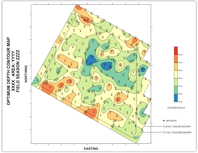
I am going to prepare an optimum depth (OD) contour map for drilling of shot holes from the data obtained from upholes as shown below.

Preparing data
1. Prepare an excel sheet which contains 'Northing' and 'Easting' of the area boundary corners as show below. If you have two or more boundaries then you create seperate excel sheet for each boundary or use different columns in the same sheet. In the above contour map I have two boundaries. One is the Full fold boundary (where i am expected to acquire full fold data) and shot line boundaries ( where I place my shot points). The shot line boundary is the outer most boundary. Find the outermost boundary and then note the maximum and minimum of northing and easting which you are going to plot. This will be useful while preparing grid so that grid will be generated to the full areal extended to be mapped.

2. Prepare an excel sheet with four columns containing data of 'UPHOLE NUMBER (UH NO.)', 'EASTING', ' NORTHING', 'OPTIMUM DEPTH (OD)' as shown below. Uphole number column is not compulsary for the contour map.


Preparing grid
3. Go to GRID --> DATA. In the dialogue box select the excel file which contains the Optimum depth data. If multiple sheets are there in the excel file it will prompt to select the sheet.
4. After selecting the sheet another dialogue box appears for Data columns, gridding method, grid line geometry, etc.
5. Select X for Easting, Y for Northing and Z for OD. You can experiment with different gridding methods and parameters for them. I used Kriging method with default parameters. Select the output location and file of the grid. Then in the 'Grid line geometry' enter the minimium and maximum values which we have noted from the outer most boundary as mentioned in step 1. If the spacing is more then gridding will be quick. But the down fall is that the gridding will be coarse. So while blanking if the boundary is not horizontal or vertical (like slant in this case) then edges of the contour will look like a saw tooth. To avoid that I go for fine gridding with less spacing. In this case I give values approximately 5 for both direction for fine gridding as shown below. If interested to see the statistics of the grid data then select 'Grid Report'.

6. Now go to Map --> New --> post map . A dialogue box appears where you have select the excel file containing outermost boundary details. The post map appears with + symbols at the points we specified in the excel sheet imported. The 'object manager' shows the different objects in the map. By clicking on the individual items in the object manager we can change their properties in the 'properties manager'. For example to change the symbol + for the boundary or its size, etc first click on 'Post' in the object manager and then in the Property manager go to 'General' tab, click the plus on the marker properties in the Default symbol and then change parameters you wish to. Different objects in the object manager can be easily turned on or off by just removing or adding the tick marks in the objects.

7. Now if we directly add the contour map from the grid we created in step 5 it will fill the whole rectangle. But we require contours only within our area. So to avoid that we have to blank the unwanted portion. For blanking the grid we have to created a blanking (bln) file. Now select the post map in the object manager. Then go to Map --> Digitize (Note: If you did not select Post in the object manager then Digitize will not be highlighted). Now if the cursor is brought into the plot it will turn into + kind of shape. Now click on all the boundary markers once. You will find red coloured plus symbol at the place you click. (For more accuracy zoom and click. More better clarity turn off the Axis by removing tick marks of the axis in the object manager). A small window 'Digitized Coordinates' will appear and will updated with the coordinates where you click. Now click on all the boundary markers. Then on the 'Digitized Coordinates' Go to File -->Save and save the digitized bln file.


8. Now the open the bln file saved in step 7 with some text editor like notepad. In the first row there will be two numbers separated by comma. The first number indicates the number of boundary markers clicked in step 7. Second number is an index. By default it is 1. Change it to 0 and save the file. 1 indicates whatever inside the boundary will be blanked. 0 indicates whatever outside the boundary will be blanked. Since we want to blank contour details outside the boundary area we make it to 0.
9. Now go to Grid --> Blank. In the dialogue box 'Open grid' select the grid file we want to blank i.e., the grid file generated in step 5. In the next dialogue box select the bln file saved in step 8. In the next dialogue box 'Save grid as' give a name to the blanked grid file and save it. This is the grid file we are going to use to draw the contour.

11. After selecting map in the object manager go to Map --> Add --> Contour layer. Select the Blanked grid generated in step 9. The contour appears as shown below. You can note that the contour is with in the boundary. (Tips: Instead of doing Map --> Add --> Contour layer if you do Map -->New --> Contour Map then a new map will be created with its own x and y axis. it the scales do not match then we have adjust them and it will look clumsy. Best method is to create one map and then add layers to it so they all will have same x and y axis).

9. Now go to Grid --> Blank. In the dialogue box 'Open grid' select the grid file we want to blank i.e., the grid file generated in step 5. In the next dialogue box select the bln file saved in step 8. In the next dialogue box 'Save grid as' give a name to the blanked grid file and save it. This is the grid file we are going to use to draw the contour.
Contouring
10. Now go to Draw --> Polygon and join all the boundary markers to make a polygon of the boundary. Then remove the tick mark in post so plus symbols of the boundary will not appear.
11. After selecting map in the object manager go to Map --> Add --> Contour layer. Select the Blanked grid generated in step 9. The contour appears as shown below. You can note that the contour is with in the boundary. (Tips: Instead of doing Map --> Add --> Contour layer if you do Map -->New --> Contour Map then a new map will be created with its own x and y axis. it the scales do not match then we have adjust them and it will look clumsy. Best method is to create one map and then add layers to it so they all will have same x and y axis).

12. Now the contours are not filled. To fill them first select Contours in the object manager. Then in the property Manager, Under General tab, below 'Filled Contours', place a tick mark for 'Fill contours'. Put a tick mark for colour scale to place colour scale into the map. Now the contours are filled with gray scale. To change them to colour 'Levels' tab in the property manager. Under 'General' find fill colours. Click on the 'GrayScale'. Use the drop-down menu and chose predetermined colour levels. I have used 'Geology'. Then you can change various parameters like 'Contour interval', Major contours, Minimum and Maximum contours. I have set contour interval to 2 and Major contour every 1. It appears like as below.

13. To place the upholes in the map, click 'map' in the object manager and then go to Map --> Add --> Post layer. select the excel sheet we created it step 2 containing uphole details. Select the sheet containing the data. Now the surfer give warning that 'layer exceed current map limits..... Do you want to adjust... '. Click No .
14. Now click post you added just now. In the Property Manager, Under general tab, Worksheet columns, for X coordinates select 'Easting' column from the drop down menu and northing column for Y coordinates. While doing this warning may come as in previous step. Click No for the warnings. Now you can see plus marker at the uphole positions. Marker shapes, colours, etc., for upholes can be changed under 'Default symbol', 'Marker properties' (click the plus on the left to expand 'Marker properties' options). I changed to symbol 12 which is circle. Then I reduced the size in 'Symbol size'.
15. Now to display Uphole numbers near the uphole markers, select the post map for uphole in the object manager. In the Property manager go to 'Labels' tab. Under labels for Worksheet sheet select UH No. from the drop-down menu. Now numbers appear near the marker. The font size, etc., can be changed by expanding Font Properties. (To add an prefix to the uphole numbers like 24 to UH-24 , expand label format options, in the prefix add UH- so it appears in the above format.)
16. To add full fold boundary select 'Map' in the Object Manager and then go to Map --> Add --> Post layer. Select the excel sheet for the full fold boundary. Join the boundary markers with Polygons as we did in step 6 and step 10.

17. Now you can add various text boxes and symbols to explain the map so the final contour map is ready like this below!
Tips
1. Since there will lot of post layers it will be wise to rename the post layers with appropriate names to avoid confusion.2. For printing purpose export the file in PDF(Vector) format for a crip output and crisp printing. Go to File --> Export. In the dialogue box enter the name and in save type as select PDF (vector) from the drop-down menu. In 'Export options' go to Vector PDF options give a high value like 100 for 'resize embedded images to ...' for better output when size is not a consideration.
3. For Presentation purposes instead of saving it in JPEG or PNG format save it in Tif Tagged image (Tiff) format to get a good picture quality. While saving in Tiff using '32-bit true colour alpha' for colour depth.
If you need the data used in this explanation for practising contact me with your mail id.
Disclaimer: All the data shown here is fictional, used for illustrative purpose only.
Subscribe to:
Posts (Atom)