Contour maps
While acquiring seismic data for hydrocarbon exploration one has to plot a variety of contour maps like velocity or depth contour maps for uphole surveys, frequency contour maps for the data acquired, etc. One of the easiest and efficient way of making contour maps is by using Surfer software.
Definition
A contour is a line on a map or a chart delineating those points which have same plotted quantity like depth, velocity, altitude, etc. In simple words it is a line connecting points of same altitude or depth, etc in a map.
Allowance has to be made for uncertainties so that noise is not contoured, and a contour value of Ci can be thought of as marking the middle of a zone that contains values Ci±N, where N is the mean noise level.
The smallest meaningful contour interval is about twice the noise level so that uncertainty ranges do not overlap. We can choose the contour interval as per our requirement which is atleast twice about the noise level.
Softwares
Contours can be plotted in a variety of softwares like excel, Grapher, Origin, Igor pro, etc. I feel easy to plot contours for seismic data acquisition in Sufer. so I would explain how to plot contours using sufer 10. The layout slightly varies for older surfer. Nevertheless the options can be found easily. Now let us get into action and make our hands dirt!
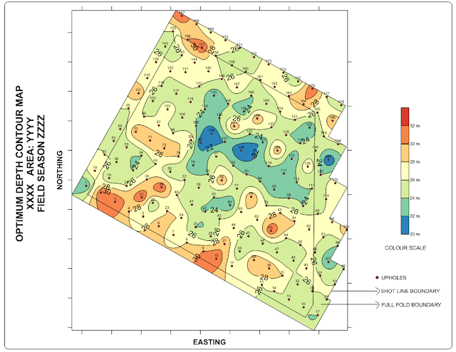
I am going to prepare an optimum depth (OD) contour map for drilling of shot holes from the data obtained from upholes as shown below.

Preparing data
1. Prepare an excel sheet which contains 'Northing' and 'Easting' of the area boundary corners as show below. If you have two or more boundaries then you create seperate excel sheet for each boundary or use different columns in the same sheet. In the above contour map I have two boundaries. One is the Full fold boundary (where i am expected to acquire full fold data) and shot line boundaries ( where I place my shot points). The shot line boundary is the outer most boundary. Find the outermost boundary and then note the maximum and minimum of northing and easting which you are going to plot. This will be useful while preparing grid so that grid will be generated to the full areal extended to be mapped.

2. Prepare an excel sheet with four columns containing data of 'UPHOLE NUMBER (UH NO.)', 'EASTING', ' NORTHING', 'OPTIMUM DEPTH (OD)' as shown below. Uphole number column is not compulsary for the contour map.


Preparing grid
3. Go to GRID --> DATA. In the dialogue box select the excel file which contains the Optimum depth data. If multiple sheets are there in the excel file it will prompt to select the sheet.
4. After selecting the sheet another dialogue box appears for Data columns, gridding method, grid line geometry, etc.
5. Select X for Easting, Y for Northing and Z for OD. You can experiment with different gridding methods and parameters for them. I used Kriging method with default parameters. Select the output location and file of the grid. Then in the 'Grid line geometry' enter the minimium and maximum values which we have noted from the outer most boundary as mentioned in step 1. If the spacing is more then gridding will be quick. But the down fall is that the gridding will be coarse. So while blanking if the boundary is not horizontal or vertical (like slant in this case) then edges of the contour will look like a saw tooth. To avoid that I go for fine gridding with less spacing. In this case I give values approximately 5 for both direction for fine gridding as shown below. If interested to see the statistics of the grid data then select 'Grid Report'.

6. Now go to Map --> New --> post map . A dialogue box appears where you have select the excel file containing outermost boundary details. The post map appears with + symbols at the points we specified in the excel sheet imported. The 'object manager' shows the different objects in the map. By clicking on the individual items in the object manager we can change their properties in the 'properties manager'. For example to change the symbol + for the boundary or its size, etc first click on 'Post' in the object manager and then in the Property manager go to 'General' tab, click the plus on the marker properties in the Default symbol and then change parameters you wish to. Different objects in the object manager can be easily turned on or off by just removing or adding the tick marks in the objects.

7. Now if we directly add the contour map from the grid we created in step 5 it will fill the whole rectangle. But we require contours only within our area. So to avoid that we have to blank the unwanted portion. For blanking the grid we have to created a blanking (bln) file. Now select the post map in the object manager. Then go to Map --> Digitize (Note: If you did not select Post in the object manager then Digitize will not be highlighted). Now if the cursor is brought into the plot it will turn into + kind of shape. Now click on all the boundary markers once. You will find red coloured plus symbol at the place you click. (For more accuracy zoom and click. More better clarity turn off the Axis by removing tick marks of the axis in the object manager). A small window 'Digitized Coordinates' will appear and will updated with the coordinates where you click. Now click on all the boundary markers. Then on the 'Digitized Coordinates' Go to File -->Save and save the digitized bln file.


8. Now the open the bln file saved in step 7 with some text editor like notepad. In the first row there will be two numbers separated by comma. The first number indicates the number of boundary markers clicked in step 7. Second number is an index. By default it is 1. Change it to 0 and save the file. 1 indicates whatever inside the boundary will be blanked. 0 indicates whatever outside the boundary will be blanked. Since we want to blank contour details outside the boundary area we make it to 0.
9. Now go to Grid --> Blank. In the dialogue box 'Open grid' select the grid file we want to blank i.e., the grid file generated in step 5. In the next dialogue box select the bln file saved in step 8. In the next dialogue box 'Save grid as' give a name to the blanked grid file and save it. This is the grid file we are going to use to draw the contour.

11. After selecting map in the object manager go to Map --> Add --> Contour layer. Select the Blanked grid generated in step 9. The contour appears as shown below. You can note that the contour is with in the boundary. (Tips: Instead of doing Map --> Add --> Contour layer if you do Map -->New --> Contour Map then a new map will be created with its own x and y axis. it the scales do not match then we have adjust them and it will look clumsy. Best method is to create one map and then add layers to it so they all will have same x and y axis).

9. Now go to Grid --> Blank. In the dialogue box 'Open grid' select the grid file we want to blank i.e., the grid file generated in step 5. In the next dialogue box select the bln file saved in step 8. In the next dialogue box 'Save grid as' give a name to the blanked grid file and save it. This is the grid file we are going to use to draw the contour.
Contouring
10. Now go to Draw --> Polygon and join all the boundary markers to make a polygon of the boundary. Then remove the tick mark in post so plus symbols of the boundary will not appear.
11. After selecting map in the object manager go to Map --> Add --> Contour layer. Select the Blanked grid generated in step 9. The contour appears as shown below. You can note that the contour is with in the boundary. (Tips: Instead of doing Map --> Add --> Contour layer if you do Map -->New --> Contour Map then a new map will be created with its own x and y axis. it the scales do not match then we have adjust them and it will look clumsy. Best method is to create one map and then add layers to it so they all will have same x and y axis).

12. Now the contours are not filled. To fill them first select Contours in the object manager. Then in the property Manager, Under General tab, below 'Filled Contours', place a tick mark for 'Fill contours'. Put a tick mark for colour scale to place colour scale into the map. Now the contours are filled with gray scale. To change them to colour 'Levels' tab in the property manager. Under 'General' find fill colours. Click on the 'GrayScale'. Use the drop-down menu and chose predetermined colour levels. I have used 'Geology'. Then you can change various parameters like 'Contour interval', Major contours, Minimum and Maximum contours. I have set contour interval to 2 and Major contour every 1. It appears like as below.

13. To place the upholes in the map, click 'map' in the object manager and then go to Map --> Add --> Post layer. select the excel sheet we created it step 2 containing uphole details. Select the sheet containing the data. Now the surfer give warning that 'layer exceed current map limits..... Do you want to adjust... '. Click No .
14. Now click post you added just now. In the Property Manager, Under general tab, Worksheet columns, for X coordinates select 'Easting' column from the drop down menu and northing column for Y coordinates. While doing this warning may come as in previous step. Click No for the warnings. Now you can see plus marker at the uphole positions. Marker shapes, colours, etc., for upholes can be changed under 'Default symbol', 'Marker properties' (click the plus on the left to expand 'Marker properties' options). I changed to symbol 12 which is circle. Then I reduced the size in 'Symbol size'.
15. Now to display Uphole numbers near the uphole markers, select the post map for uphole in the object manager. In the Property manager go to 'Labels' tab. Under labels for Worksheet sheet select UH No. from the drop-down menu. Now numbers appear near the marker. The font size, etc., can be changed by expanding Font Properties. (To add an prefix to the uphole numbers like 24 to UH-24 , expand label format options, in the prefix add UH- so it appears in the above format.)
16. To add full fold boundary select 'Map' in the Object Manager and then go to Map --> Add --> Post layer. Select the excel sheet for the full fold boundary. Join the boundary markers with Polygons as we did in step 6 and step 10.

17. Now you can add various text boxes and symbols to explain the map so the final contour map is ready like this below!
Tips
1. Since there will lot of post layers it will be wise to rename the post layers with appropriate names to avoid confusion.2. For printing purpose export the file in PDF(Vector) format for a crip output and crisp printing. Go to File --> Export. In the dialogue box enter the name and in save type as select PDF (vector) from the drop-down menu. In 'Export options' go to Vector PDF options give a high value like 100 for 'resize embedded images to ...' for better output when size is not a consideration.
3. For Presentation purposes instead of saving it in JPEG or PNG format save it in Tif Tagged image (Tiff) format to get a good picture quality. While saving in Tiff using '32-bit true colour alpha' for colour depth.
If you need the data used in this explanation for practising contact me with your mail id.
Disclaimer: All the data shown here is fictional, used for illustrative purpose only.
It is very simple and useful to plot contour maps. I feel it can be used basically any contouring. If possible explain how to use grapher also.
ReplyDeleteThanks for your details explanation bro!
ReplyDeletedo you know how to do the contour map on just excell i cant get surfer
ReplyDeletethanks
Sorry to say this Mr.Saleem.. There is no direct way to plot contour map in excel
DeleteHi Balaji
DeleteSorry for the stupid question:
How can I generate a 2D image of seismic velocity again depth (z) and Offset ( easting x)?
henri